Change the appearance or content of a cluster analysis diagram
Cluster analysis diagrams can help you to see patterns in your data. This topic describes how to change the diagram type or the data that is displayed.
What do you want to do?
- Change the diagram type
- Zoom in or out of a diagram
- Rotate a 3D Diagram
- Show more (or fewer) lines in a circle graph
- Change the items displayed on the diagram
- Change the number of clusters in the diagram
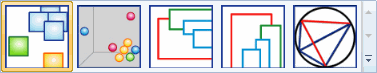
Change the diagram type
NVivo provides the following diagram types: 2D and 3D Cluster Maps; Horizontal and Vertical Dendrograms, and circle graphs. Refer to About cluster analysis for more information on the types of cluster analysis diagrams.
-
On the Cluster Analysis tab, in the Type group, click the diagram type that you want.

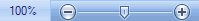
Zoom in or out of a diagram
To quickly zoom in or out:
-
On the Status bar, click the Zoom slider.
-
Slide to the percentage zoom setting that you want.
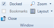
To choose a particular zoom setting:
-
On the View tab, in the Window group, click Zoom, and then select the required zoom level.
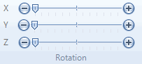
Rotate a 3D Diagram
The 3D Cluster Map represents the similarities of the selected items in a three-dimensional space. You can rotate the diagram to view it from a different perspective.
-
On the Cluster Analysis tab, in the Rotation group, click and drag the X, Y, or Z slider to rotate the diagram.
Shortcut You can also click and drag your mouse to rotate the 3D diagram.
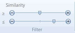
Show more (or fewer) lines in a circle graph
When you create a circle graph only items with strong similarity are connected by lines in the graph.
If the graph has no lines, or you want to show more lines (for example, you want to see weak as well as strong similarity), you can adjust the filters which determine the number of lines shown in the graph.
-
On the Cluster Analysis tab, in the Filter group, use the
 slider (lower limit) or
  slider (upper limit) to filter the lines based on their similarity
index value.
slider (upper limit) to filter the lines based on their similarity
index value.
NOTE
-
When you move the slider bars, the similarity index value that you are selecting is displayed as a screen tip.
-
The summary tab of the circle graph shows the similarity index values that are used to generate the lines on the graph. When you adjust the sliders you are changing the filter applied to these values. Refer to How are cluster analysis diagrams generated? to understand more about similarity index values.
Change the items displayed on the diagram
-
On the Cluster Analysis tab, in the Options group, click Select Data.

The Cluster Analysis Options dialog box opens.
-
Click Select, and then add or remove items using the Select Project Items dialog box.
-
(Optional) Change other options, as required—refer to About cluster analysis (Cluster by word, coding or attribute value similarity) or About cluster analysis (Selecting a similarity metric) for more information.
-
Click OK.
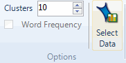
Change the number of clusters in the diagram
- On the Cluster Analysis tab, in the Options group, in the Clusters box, enter the number of clusters you want to show in the diagram..