


About cluster analysis
Cluster analysis can help you to see patterns in your data. This topic introduces the cluster analysis technique and provides links to other useful topics.
You can also watch the video tutorial Visualize your project.
In this topic
- What is cluster analysis?
- Types of cluster analysis diagrams
- Cluster by word, coding or attribute value similarity
- Selecting a similarity metric
What is cluster analysis?
Cluster analysis is an exploratory technique that you can use to visualize patterns in your project by grouping sources or nodes that share similar words, similar attribute values, or are coded similarly by nodes. Cluster analysis diagrams provide a graphical representation of sources or nodes to make it easy to see similarities and differences. Sources or nodes in the cluster analysis diagram that appear close together are more similar than those that are far apart.
You can use cluster analysis diagrams to visualize:
-
The similarities and differences across your sources—for example, how similar are the submissions from the various community members?
-
The similarities and differences across your nodes—for example, how similar is the coding at rising sea levels, flood control, soil erosion, and land reclamation?
-
The demographic spread of your survey respondents based on attribute value.
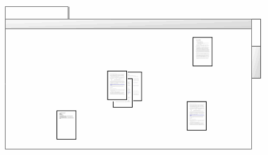
In the image below, the cluster of three documents indicates a close similarity. The other three documents are shown further apart which indicates that they are dissimilar.
When you create a cluster analysis diagram in NVivo, it displays in Detail View with two tabs:
-
The Diagram tab displays the visual representation of your data.
-
The Summary tab displays the similarity index values used to generate the diagram.
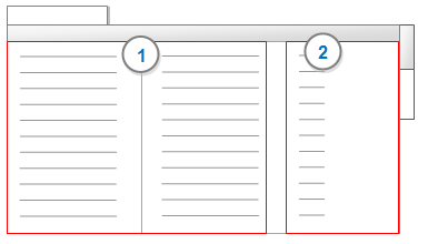
1 Items compared—each possible pair of selected items is listed as a row in the table.
2 Similarity Index—displays a value that indicates the degree of similarity for each pair of items based on the similarity metric selected. Items with a high similarity index (maximum=1) indicate a strong similarity and are displayed closer together on the cluster analysis diagram.

Types of cluster analysis diagrams
When you create a cluster analysis diagram, by default it is displayed as a horizontal dendrogram. You can select from a gallery of cluster analysis diagrams—experiment with the diagram types to find the one that best fits the project items you are exploring.
| Type | Description | Example |
| 2D Cluster Map |
A two-dimensional diagram where similar items are clustered together and different items are further apart. |
|
| 3D Cluster Map |
A three-dimensional diagram where similar items are clustered together and different items are further apart. The diagram can be rotated in three dimensions. |
|
| Horizontal Dendrogram |
A horizontal branching diagram where similar items are clustered together on the same branch and different items are further apart. Dendrograms can be useful for comparing pairs of items. |
|
| Vertical Dendrogram |
A vertical branching diagram where similar items are clustered together on the same branch and different items are further apart. Dendrograms can be useful for comparing pairs of items. |
|
| Circle Graph |
A circle where all the items are represented as points on the perimeter. Similarity between items is indicated by connecting lines of varying thickness and color. Similarity is indicated by blue lines—thicker lines indicate stronger similarity. Dissimilarity is indicated by red lines—thicker lines indicate stronger dissimilarity. |
|


Cluster by word, coding or attribute value similarity
The sources or nodes in a cluster analysis diagram, can be clustered by word similarity, coding similarity or attribute value similarity.
| Cluster by | Description |
| Word similarity | The words contained in the selected sources or
nodes are compared.
Sources or nodes that have a higher degree of similarity based on the occurrence and frequency of words are shown clustered together. Sources or nodes that have a lower degree of similarity based on the occurrence and frequency of words are displayed further apart. Stop words are excluded when using this measure of similarity—refer to Set the text content language and stop words for more information. |
| Coding similarity | The coding at the selected sources or nodes is
compared.
Sources or nodes that have been coded similarly are clustered together on the cluster analysis diagram. Sources or nodes that have been coded differently are displayed further apart on the cluster analysis diagram. |
| Attribute value similarity | The attribute values of the selected sources or nodes are compared.
Sources or nodes that have similar attribute values are clustered together on the cluster analysis diagram. Sources or nodes that have different attribute values are displayed further apart on the cluster analysis diagram. |
Selecting a similarity metric
A similarity metric is a statistical method used to calculate correlation between items. When you create a cluster analysis diagram using the Cluster Analysis Wizard, you can choose from the following similarity metrics:
-
Pearson correlation coefficient
-
Jaccard's coefficient
-
Sørensen's coefficient
For more information on how similarity is measured, refer to How are cluster analysis diagrams generated?