


About charts
You can use charts to present or explore your project. Charts can help you answer questions—for example, Which sources are most/least coded at the node Habitat? or What is the demographic spread of my survey participants? This topic gets you up and running with charts and provides links to other useful topics.
You can also watch the video tutorial Visualize your project.
In this topic
Understanding charts
Charts display in Detail View with two tabs:
-
The Chart tab displays the visual representation of your data.
-
The Summary tab displays data values that were used to generate the chart.
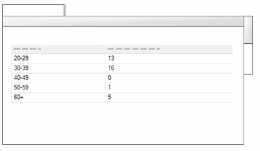

Chart your coding
You can create charts to display:
-
Coding for a source Shows coding information for a particular source. You can see which nodes are most used to code a source—for example, the source Competing water uses is most coded by the node Economy. You can also see how much coding is done on a source and which users coded the source.
-
Coding by attribute value for a source Shows how a particular source is coded against one or two classified node attributes and their corresponding combinations of attribute values. This can help you see which demographic groups are most/least represented in nodes that code a specific source—for example, Interview about Coastal Flooding is least coded by nodes representing males aged over 50.
-
Coding by attribute value for multiple sources Shows multiple sources as coded against a particular classified node attribute and its set of attribute values. This can help you determine which demographic groups are most/least represented in nodes that code a range of sources—for example, Discussion Group 1 is coded mostly at nodes representing participants under 40 years old, while Discussion Group 2 is coded mostly at nodes representing participants over 50.
-
Coding for a node Shows how a particular node is used in coding sources. This can help you see which sources are most or least coded at a node—for example, the node Habitat has more coding references from the source Interview with Barbara than from any other source. You can also display the users that did the coding.
-
Coding by attribute value for a node Shows how a particular node is matched against one or two classified node attributes and their corresponding combinations of attribute values. This can help you determine which demographic group is most coded at a specific node—for example, residents from Riverside have spoken out the most about flood control.
-
Coding by attribute value for multiple nodes Shows multiple nodes matched against a particular classified node attribute and its set of attribute values. This can help you determine which demographic groups have been coded most or least at a set of nodes—for example, residents from Bayview are most concerned about land reclamation, while residents from Riverside are most concerned about flood control.
Chart your sources
If you have classified your sources, you can create charts to display:
-
Sources by attribute value for an attribute Shows the number of sources that match each value for a particular attribute. This can help you see the range of journal articles or other source materials in your project—for example, the year of publication.
-
Sources by attribute value for two attributes Shows the number of sources that match various combinations of two attributes. This can help you see the range of journal articles or other source materials in your project—for example, year of publication and journal.
Chart your nodes
If you have classified your nodes, you can create charts to display:
-
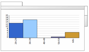
Nodes by attribute value for an attribute Shows the number of nodes that match each value for a particular attribute. This can help you see the demographic spread of your survey participants by a single attribute—for example age group.
-
Nodes by attribute value for two attributes Shows the number of nodes that match various combinations of two attributes. This can help you see the demographic spread of your survey participants by two attributes—for example, age group and education
Types of charts
NVivo provides a range of chart types—the available chart types vary depending on the data you have chosen to view in the chart:
| Type | Description | Example |
| Bar |
Bar charts are useful when comparing quantity or analyzing an increasing/decreasing trend. Variations on this type of chart include:
|
|
| Column |
Column charts are useful when comparing quantity or analyzing an increasing/decreasing trend. Variations on this type of chart include:
|
|
| Pie |
Pie charts effectively show the proportion of different parts that make up a whole. |
|
|
Bubble charts |
Bubble charts show varying density of data when comparing combinations of variables. |
|
|
Heat maps |
Heat maps show varying density of data when comparing combinations of variables or matrices. |
|
| Radar charts |
Radar effectively displays direction or trend when comparing several variables. |
|


