


About tree maps
Tree maps can help you to see patterns in your coding or make comparisons based on attribute values. This topic introduces tree maps and provides links to other useful topics.
You can also watch the video tutorial Visualize your project.
In this topic
- What is a tree map?
- What can I show in a tree map?
- How tree map options affect the size and color of the rectangles
What is a tree map?
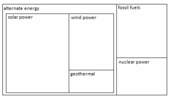
A tree map is a diagram that shows hierarchical data as a set of nested rectangles of varying sizes. You could create a tree map of nodes to compare the number of coding references. A node with a large number of coding references would display as a large rectangle. The tree map is scaled to best fit the available space, so the sizes of the rectangles should be considered in relation to each other, rather than as an absolute number.
In the tree map below, solar power, wind power and fossil fuels have more coding references than the other nodes. Also, there are more coding references for the child nodes of alternate energy nodes than either fossil fuels or nuclear power.
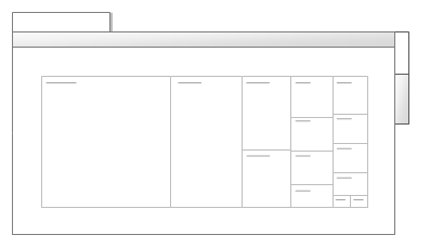
When you create a tree map in NVivo, it displays in Detail View with two tabs:
-
The Tree Map tab displays the visual representation of your data.
-
The Summary tab displays the underlying data in a table format.

What can I show in a tree map?
You can use tree maps to see patterns of coding in your project, or compare sources or nodes based on their attribute values.
Sources With a tree map of sources, you can:
-
Compare the amount of coding of your sources—are some sources more heavily coded than others?
-
Identify sources with most coding references at specific nodes—for example, which sources contain the most coding references to wind power?
Nodes With a tree map of nodes, you can:
-
Compare the amount of coding at your nodes—do some nodes contain more coding references than others?
-
Visualize prominent themes in your project
-
Identify areas that need further investigation or research
Attribute value combinations If you have classified your sources or classified your nodes, you can:
-
View the demographic spread of your survey respondents
-
Check that you have consulted a variety of sources—for example, have I relied too heavily on journal articles that are more than ten years old?
How tree map options affect the size and color of the rectangles
When you create a tree map using the Tree Map Wizard, you select what you want to compare in the tree map, and whether you want to use color to show additional information. The choices you make, will affect the size and color of the rectangles displayed on the tree map.
The examples below show how your choices can affect size and color in a tree map of sources:
| Example | Compare by (size) | Use color to show |
The size of the rectangles reflects the number of coding references. Color is not used.  |
Number of coding references | Color not selected |
Both color and size of the rectangles shows the number of coding references. 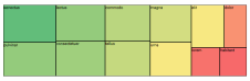 |
Number of coding references | Number of coding references |
The size of the rectangles shows the number of coding references. The color of the rectangles shows the number of nodes coding the source. 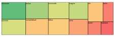 |
Number of coding references | Number of nodes coding the sources |
The size of the rectangles shows the number of coding references. The colors of the rectangles reflect colors of the sources. Sources with no color are white. 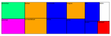 |
Number of coding references | Item colors |